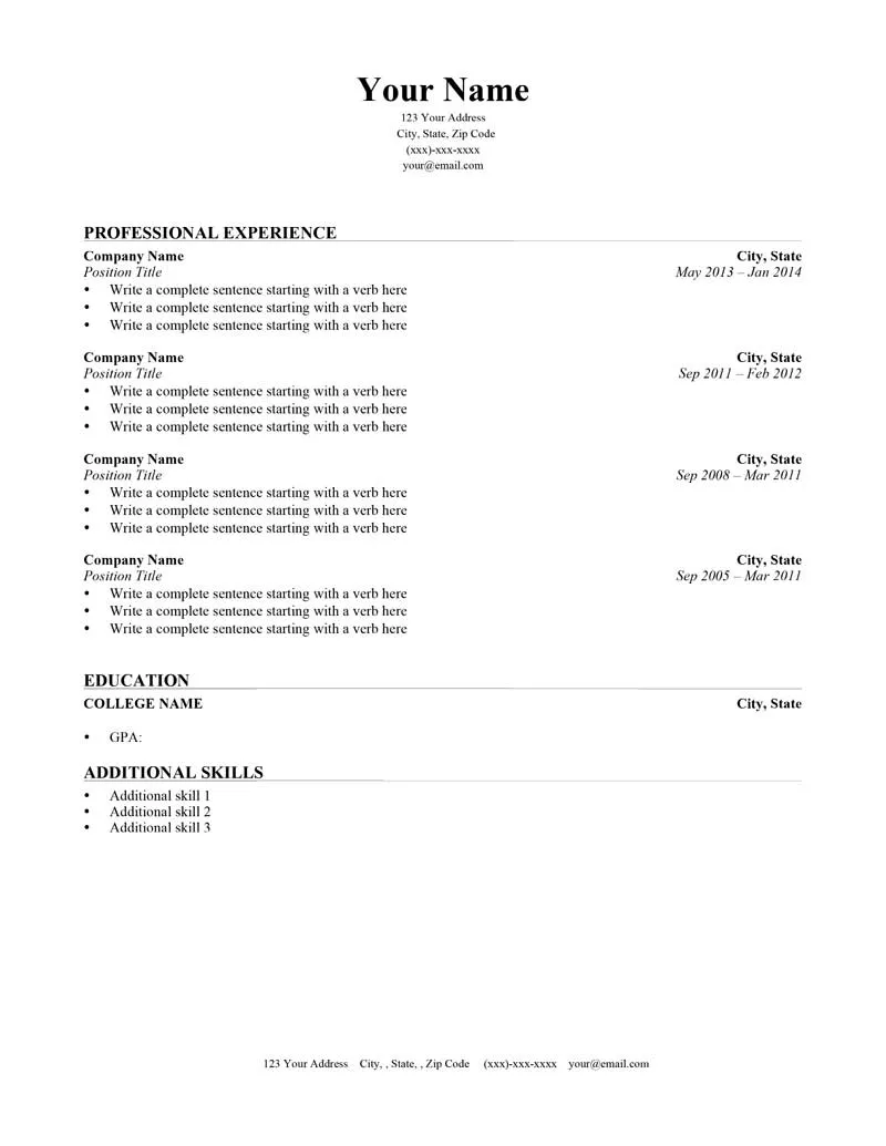
Why Cover Letter Font Matters
In the competitive world of job applications, every detail counts. Your cover letter is your first introduction to a potential employer, and it significantly influences their impression of you. While the content is paramount, the font you choose plays a crucial role in conveying professionalism, readability, and attention to detail. A well-chosen font enhances the visual appeal of your cover letter, making it easier for the hiring manager to read and digest the information. Conversely, a poorly selected font can create a negative first impression, signaling a lack of care or understanding of professional standards. This seemingly minor element can subtly influence how your qualifications are perceived, affecting your chances of landing an interview. The right font ensures your message is not only read but also well-received, contributing to the overall success of your application.
Impact of Font Choice
The font you select impacts several aspects of your cover letter’s effectiveness. First, it directly affects readability. A clear, easy-to-read font allows the hiring manager to quickly scan your letter and grasp the key information. Fonts that are too ornate, stylized, or small can strain the eyes, making it challenging to focus on your qualifications and experiences. Second, font choice communicates your personality and professionalism. A conservative font, like Times New Roman, might be suitable for traditional industries, while a more modern font, such as Calibri or Helvetica, can work well in contemporary fields. Third, the font contributes to the overall aesthetic of your cover letter. A well-chosen font complements the layout and design, creating a cohesive and polished look. This attention to detail suggests you care about the quality of your work and are willing to go the extra mile to present yourself effectively. Failing to select an appropriate font can undermine the effort you put into the content, so careful consideration is essential.
Fonts to Avoid
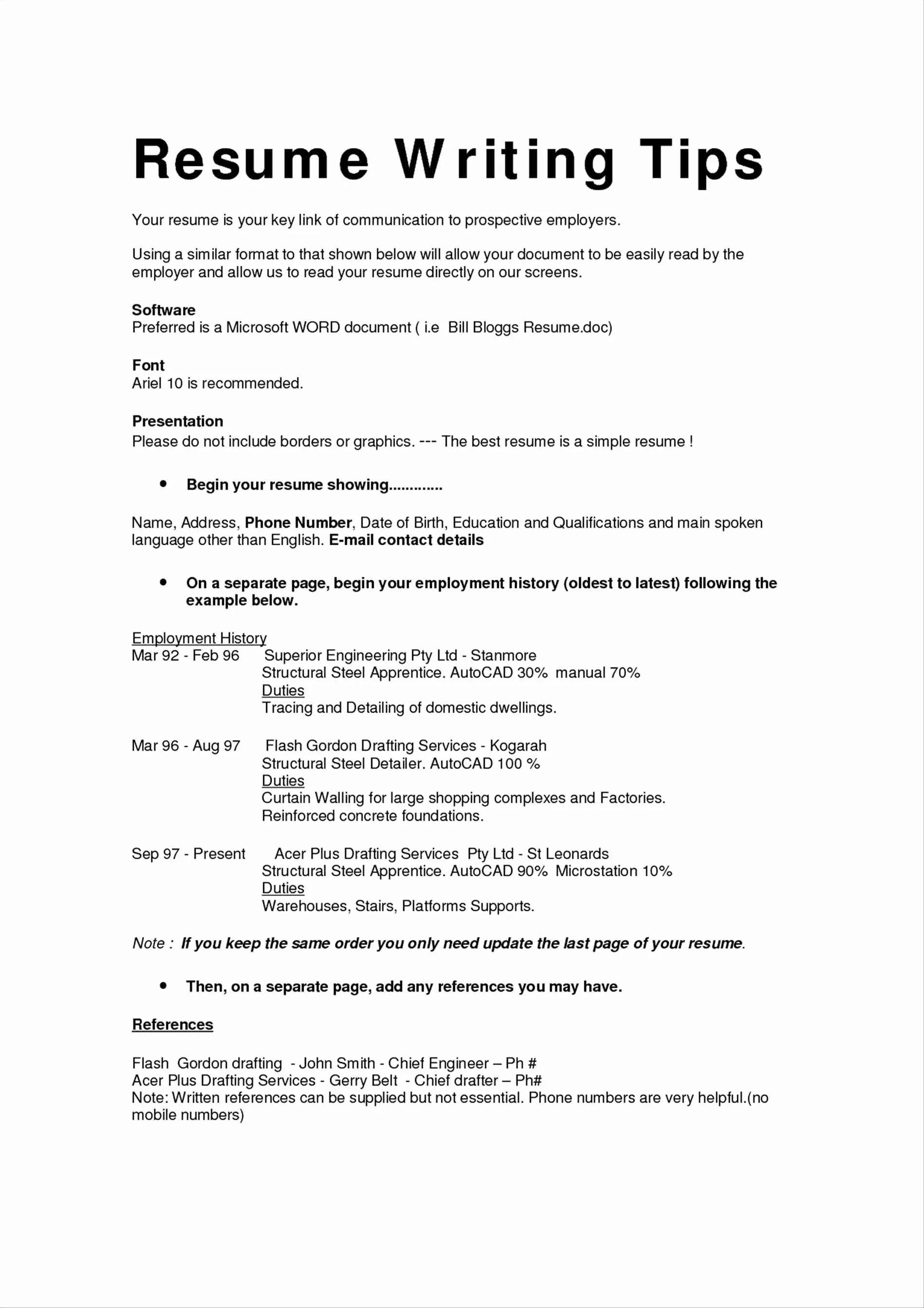
Certain fonts should be avoided when writing a cover letter, as they can detract from its professionalism and readability. Avoid overly decorative or unusual fonts like Comic Sans, Curlz, or Impact. These fonts are often perceived as unprofessional and can create a negative impression. Script fonts, which mimic handwriting, should also be used sparingly, as they can be difficult to read and may seem informal for a cover letter. Fonts that are too heavy or condensed can appear clunky and make the text difficult to scan. It’s also important to steer clear of fonts that are too small, as they can strain the reader’s eyes. Remember that the goal is to make your cover letter easy to read and visually appealing, not to make a statement with an unconventional font choice. Stick to fonts that are clean, clear, and widely accepted in professional settings to ensure your cover letter makes the right impression.
Top 5 Cover Letter Font Choices
When selecting a font for your cover letter, consider options that balance readability, professionalism, and visual appeal. Here are five top choices that are widely accepted and recommended by career experts. These fonts are all easy on the eyes and have a classic, timeless look.
Arial
Arial is a widely used sans-serif font that offers excellent readability. Its clean and straightforward design makes it a reliable choice for any cover letter. Arial is easy to scan, making it a great option for the busy hiring manager. Its versatility makes it suitable for various industries and job applications. Use a font size between 10 and 12 points for optimal readability. Arial conveys a sense of professionalism without being overly formal, ensuring your cover letter looks polished and approachable. It is a safe and effective choice, ensuring your document is easy to read and professionally presented. This ensures that your qualifications and skills are the primary focus, rather than the font style.
Times New Roman
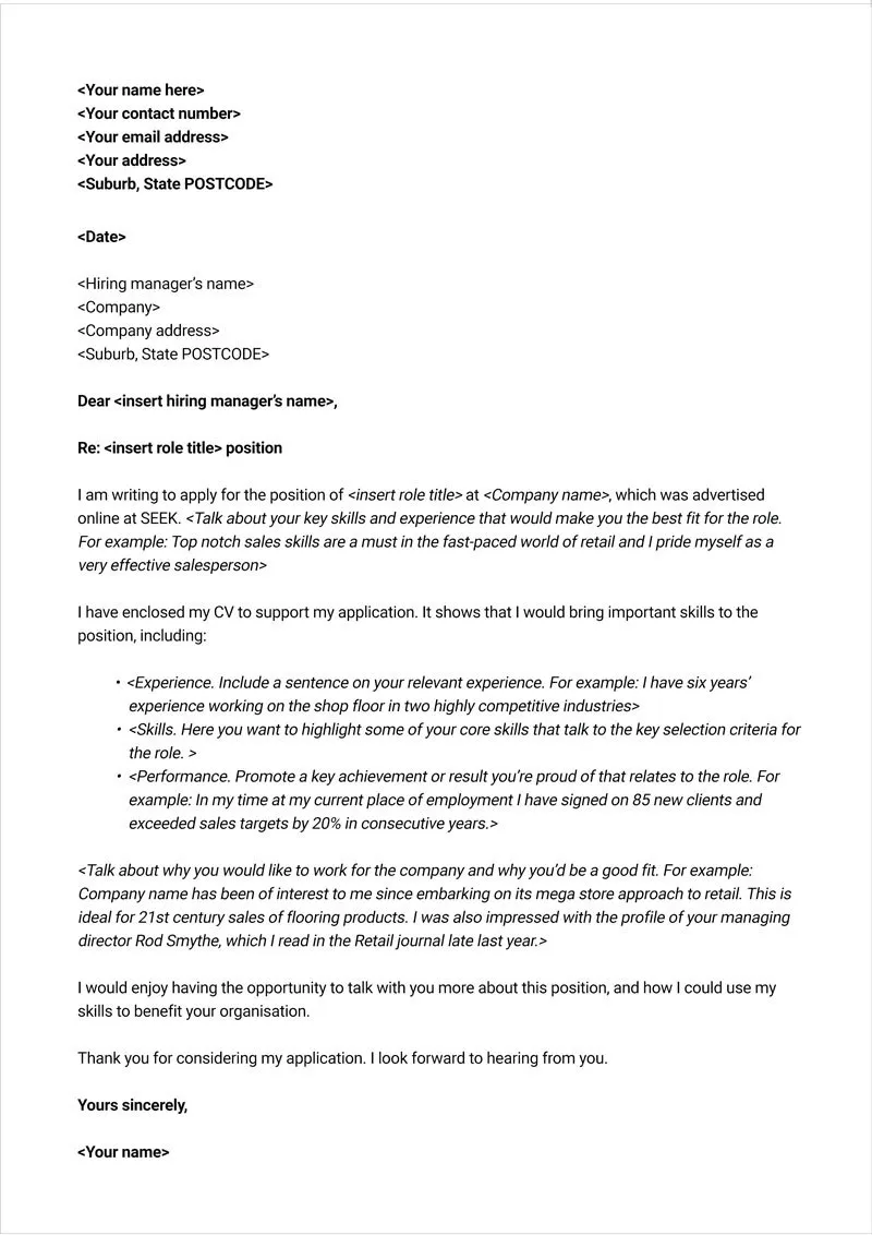
Times New Roman is a classic serif font that has been a staple in professional documents for decades. Its traditional design conveys a sense of formality and professionalism. This font is well-suited for industries that value a more conservative and traditional approach. Ensure the text is comfortably readable by using font sizes between 11 and 12 points. Its serifs (the small strokes at the end of each letter) help guide the reader’s eye across the page, improving readability. While it can be a good choice, be aware that it may seem slightly outdated to some employers, so consider your industry and the company culture before selecting this font. Always prioritize the need for a clear and concise presentation of your skills and experiences.
Calibri
Calibri is a sans-serif font that comes standard in Microsoft Office. It’s a modern and versatile font that is easy on the eyes. Its clean lines and open letterforms make it a popular choice for digital documents. It has a contemporary feel, making it suitable for a wide range of industries and job applications. Calibri’s readability makes it a good option for both print and online use. Using a font size between 11 and 12 points will provide a comfortable reading experience. This makes it an excellent option for those seeking a balance between modernity and professionalism. It is a widely accessible font that is instantly recognizable.
Garamond
Garamond is another serif font that offers an elegant and classic look. Its distinctive design lends a touch of sophistication to your cover letter. Known for its readability, Garamond allows for more text to fit on a page without seeming crowded. This font works well in environments that appreciate a refined aesthetic. When using Garamond, a font size between 11 and 12 points is generally recommended to maintain legibility. It is a stylish option for those seeking to project a sense of sophistication while maintaining readability. Remember that your font choice should complement the content, not overshadow it.
Helvetica
Helvetica is a widely recognized sans-serif font known for its simplicity and clarity. It is a versatile font suitable for a variety of purposes. Its neutral appearance makes it a great choice for almost any industry. Ensure your cover letter is easily scannable by using a font size between 10 and 12 points. Its clean lines and balanced proportions offer excellent readability. Helvetica conveys a sense of professionalism and modernity, making it suitable for both print and digital applications. It’s a safe and reliable choice that ensures your cover letter looks polished and professional.
Cover Letter Font Best Practices
Choosing the right font is just one aspect of ensuring your cover letter makes a strong impression. Following best practices will help you create a professional and readable document.
Font Size and Spacing
Use a font size between 10 and 12 points for optimal readability. This ensures your text is easy to scan and digest. Choose a font size that fits well with your chosen font style. Adjust line spacing to 1.15 or 1.5 to give your text some breathing room. Consistent spacing enhances readability and visual appeal, making your cover letter look polished. Proper spacing is essential for presenting your information clearly and professionally.
Font Consistency
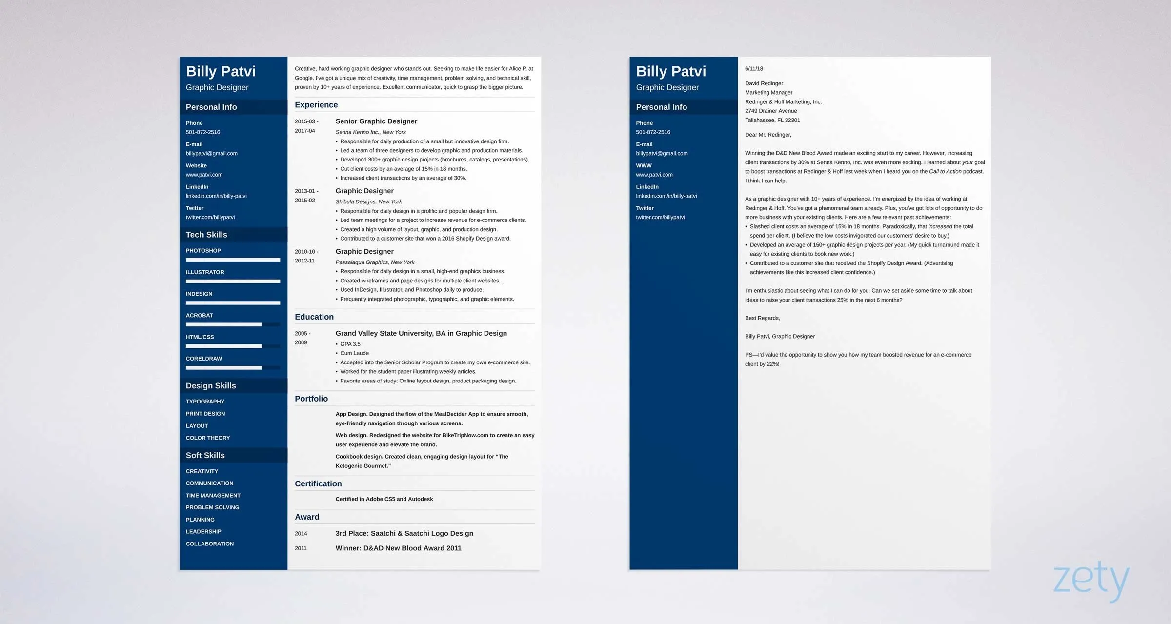
Maintain consistency throughout your cover letter. Stick to one font for the entire document to create a cohesive look. Avoid mixing font styles, as this can appear unprofessional and distract from the content. Consistency is vital for conveying a professional image and making it easy for the reader to focus on your qualifications. Using the same font throughout your cover letter demonstrates attention to detail, which will impress potential employers. Always maintain consistency for a professional and readable cover letter.
Testing Your Cover Letter
Before submitting your cover letter, always proofread it carefully. Review the document multiple times to catch any errors in spelling, grammar, or punctuation. Ask a friend or colleague to review your cover letter for feedback. Ensure that your document looks the same on different devices and platforms. Test your cover letter by emailing it to yourself to verify that the formatting and font appear as intended. By thoroughly testing your cover letter, you can make sure that it makes a strong and positive first impression.
The Final Touch
Choosing the right font for your cover letter is a crucial step in the job application process. By following these guidelines and selecting a font that suits your style and the industry you are applying to, you can increase your chances of getting noticed and landing an interview. Remember that the goal is to create a cover letter that is easy to read, visually appealing, and reflective of your professionalism. Take the time to make thoughtful decisions about font style, size, and spacing, and review your cover letter for any potential issues before sending it. By paying attention to these details, you can present your qualifications in the best possible light and increase your chances of success. Good luck with your job search!
